Friday, 31 October 2014

Monogram

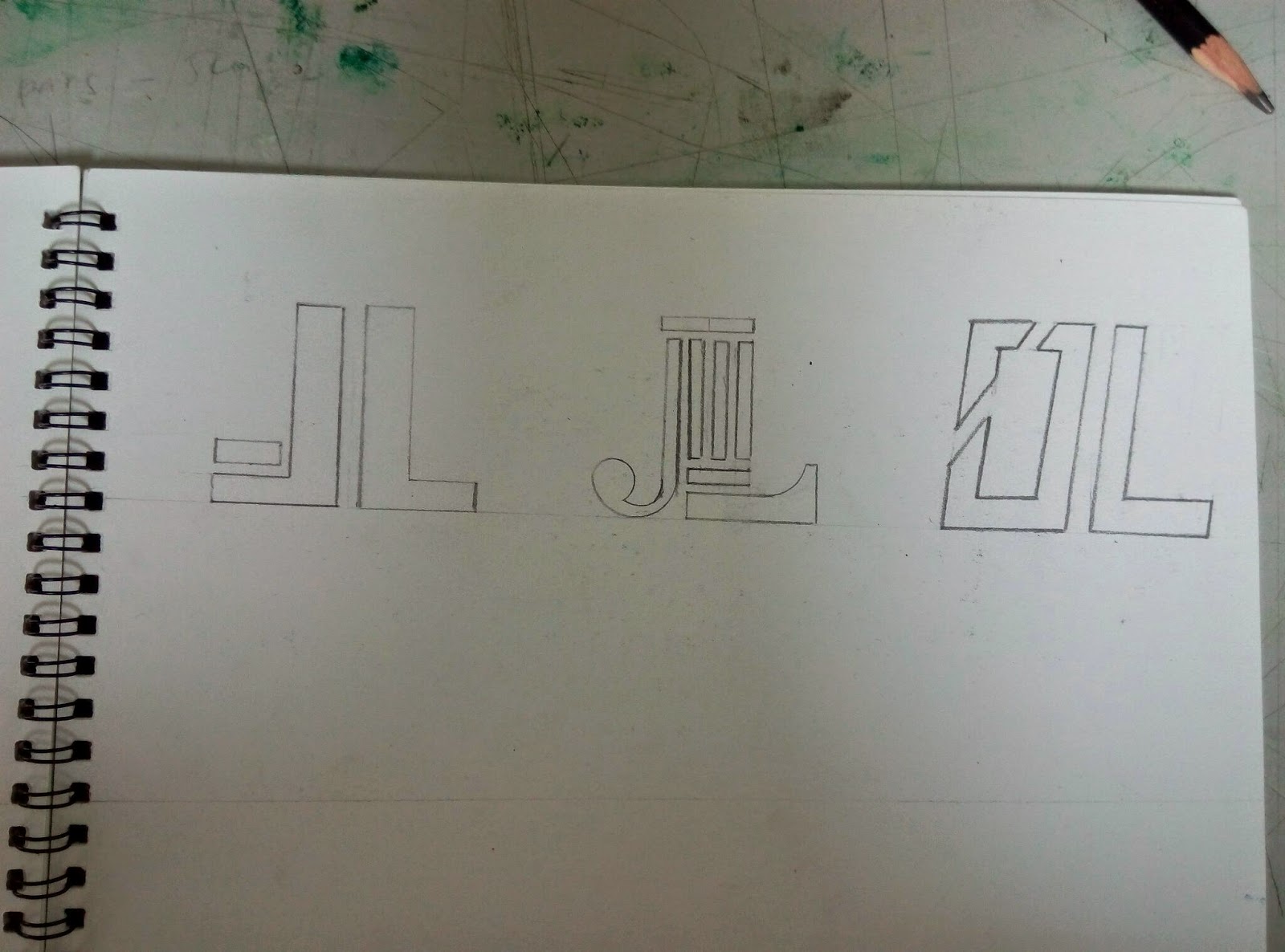
The six items that i use to design with my monogram is:
1)shoes
2)t-shirt
3)cap
4)badge
5)pouch
6)table cloth
7)clock

The first item i will design is shoe.I wanted to design my shoe like a watermelon with my logo at the back of the shoe.I use fairbro paint on my shoe.After i painted my shoe,I need to add another layer so that the paint will not wear off.The reason i draw watermelon because i like to have fun with my design.

Shoes: i design my shoe with watermelons because it makes people feel dehydrated under the hot sun.I also made research on the internet but most of the design i found were building designs amd pop art so o came out with an idea to design a watermelon sneaker.

Pouch:I feel that doing projects in university have a lot of tools to carry so i decided to sew my own pouch and design with my logo so people may know my logo.

Clock: I design my own clock because it would tell me the time so i xan manage my time on every assignment that i make.

Table cloth:i feel that it will be special to have my own table cloth because this idea is less thought by others.

T shirt:I use one white v neck t-shirt to design my logo.I dont make only one design because it will be to little so i design 1\4 of yhe shirt with me design to cover more negative spaces.

Cap:Although some classmates will design caps with one logo but i design it with a few so it will look more unique.

Final outcome

Thursday, 2 October 2014

Self Analyzing style(Monogram)

ATTITUDE
I am a extroverted person, preferring the company of others rather than spending time alone. Extroversion refers to an outward and interactive orientation. Extroverts are stimulated by being around others and are often considered gregarious or outgoing. People with this orientation usually have a lot of friends, and find it easy to interact with strangers. I tend to feel lonely and withdrawn when denied the company of others. When extroverts feel bad, low on energy, or stressed, i look outside themselves for relief. I might go shopping, call friends to come over, or arrange a party.

STYLE
There are hundreds if not thousands of parameters shaping our design, parameters that from the first glance can describe the personality of the owner inhabiting the design line.  Our existence gravitates around an unique inner factor. Our relationships and our unique qualities, perspective, interpretation and dreams are influence by thousands, millions of parameters and yet all are subdued to that inner factor: our personality.
Through our personality we are defined, through it we breath our environments, live our emotions, ups and downs. We unconsciously shape our life around it, subdued to it, it`s the mysterious force that attracts people or repels them. Personality dictates everything indirectly, the pattern we will choose, the color we will prefer in different unknown situations, the texture that we consider fit, proper, comfortable. We know “it feels right”, we know “it fits us”. Our personality is shaped through time and it can greatly evolve but it never changes completely, we are transforming ourselves through experiences of all kinds; we live.

My style is minimalism.I am the kind of person who loves to keeps things simple.I designed my monogram using simple because it is easy to manage the space for my design.My previous assignment are have a similarity which is "simple".The reason i do my assignment simple is because
sometimes we don't need to have a lot of design to be beautiful or easily recognize by people.For example Nike and Addidas.I am interested in architecture therefore I will design my monogram as similar to architecture design.I apply perspective, number, and objects to my monogram.I take this assignment as a challenge to design a logo for my future company(If I can start a firm by myself).In other words it is a style that describe an extremely organized and efficient work with a defined in a 

matter of design.The minimalist design describe as a bold yet superficial attitude in matter of design.


Minimalist pattern 

  • Sleek, simple shapes and patterns in a monochrome, toned-down palette
  • Black is your best friend 
  • Classic, simple style with a twist
  • White is perfect for this concept. Bright, white is the supremo choice however, off whites will work well also.


Wednesday, 17 September 2014

Self portrait


Miss Lisa asked us to make a self portrait.During the process in finding my won self portrait i explore about other people self portraits in the internet and most of them are unique so i try to come out with my own design of self portrait by combining other people artworks together.i spend a lot of tume trying to figure out how to make my self portrait look alike as myself.i tried typography but i felt like it was too common and some of my classmates will do the same so i reject my own typography and start another kind.Luckily Miss lisa gave us an assignment on paper cut out and i use most of my cutting skills and apply it at my self portrait.after my self portrait is done,i applied colour by flicking the brush to make spots and i use the straw to blow the watercolour so that it may look more dynamic.the colour i used in my painting is red ,blue,yellow,and green.then reason i use red colour is because it is my favorite colour and it can maych with most of the colours.Red represent passion and bravery.the blue resembles the cool emotion i have.i am not a hot tempered person.the blues also resembles sadness.when my girlfriend broke up with me i am depressed and i intended to paint to release my depression.the yellow represent happiness and friendship.i can make friends easily because i wanted to make more friends.There is a quote "the more,the merrier".the colour green reminds me of me and my friend fishing at a valley and you may ask how did the colour green represents that? Especially the green is representing the colour of the pond water and its scenery.I use it because the water ,fish and scenery is healthy.green represent healthy.I am very happy that Miss Lisa gave us this assignment because it is a way we can express ourself more by painting.

Tuesday, 12 August 2014

Expanding square

Miss Lisa gave us an assignment on expanding square.It is an interaction between dark and light. Creating a black and white collage out of a simple square, and learning about positive and negative space.We were asked to produce 2 different expanding square.one of them is symmetrical and the other is asymmetrical.The theme I use is interior design.I choose to draw it from a top view because it is easier to manage the space
Lesson learnt:
1. To learn about positive and negative space.
2. To use a simple square and all the negative cuttings to create a collage, which will inspire a mask.
3. To understand about symmetry and asymmetry, and the Principle of Design, Balance.
4. To understand the Elements of Art: Space and Shape (Positive and Negative).
5. Good design has a balance of light and dark.
6.Craftsmanship is essential to good design.

Experimenting the assignment


Cut the design or pattern

Manage the space and arrange it to make it so that it may have a unique design


The final outcome


Friday, 20 June 2014

Greeting card

This is our final assignment and Miss Lisa wanted us to make 3 greeting card.I showed her 3 theme which was teddy bear,typography and bird.Then Miss Lisa wanted me to do teddy bear because she said that teddy bear is commonly use in greeting card.We must apply what Miss Lisa taught us for the 18 weeks in the grerting card which is art movement,paper cut out and colour theory.

Progress and experimenting the greeting card

Final result
Christmas greeting card
The main colours of Christmas are red, green and gold, white and silver. Red is the colour of love and energy. The colour green like Holly and Mistletoe have been used to decorate and brighten up buildings during the long dark winter. They also reminded people that spring would come and that winter wouldn't last forever!Snowflakes, winter wonderlands, Santa'beard, the white robes of Christmas angels, white is a colour of purity and cleanliness Silver, like gold, symbolises riches. Silver is a symbol of strength and can also be related to the moon and feminine energy. 

Happy Birthday greeting card
Red draw the attention of the person away from the words and what you are trying to get the person to read.Purple symbolizes enchantment and originality.Orange are colour of enthusiasm and fascination.The 
color yellow evokes feelings of joy and also a symbol of friendship.The color green represents health, 

resilience, good fortune and youth.


Valentine's greeting card
I use red ,white and pink in Valentine's greeting card because they look great in these colours.The colour red represents love.Pink represents affection, sweetness and understanding.White symbolize spiritual,love, purity, reverence and humility. They can also connote faithfulness, a valuable component in any love relationship.

Thursday, 5 June 2014

Team base project

Miss Lisa ask us to work in groups and this year she wanted us to be different than last batch.She wanted the students and tge lecturers to have fun in this event.My team is responsible for marble design on the piece of a3 paper and make sure everything is fine.Therefore,Mrs Lisa recommend us to make some test to make sure that the thing really works.I am in charge of makeing the aluminium tray flat so that the watercolour paper can be put nicely and to make sure there wont be any texture on the paper.We use watercolour paper,poster colour which consist of monochrome colour,primary colour and secondary colour.

Wednesday, 7 May 2014

Paper cut out

Theme: Werewolf

Reflection: I choose to cut werewolf because everytime I blow my and my friends keep calling me                                 wolverine.I am facinated by werewolf because they are half human and half wolf.From this acitvity                 that Mrs Lisa gave us, I learn how to cut the paper neatly and I have to cut away the edges rather                 than pulling out the paper because the paper will look like it just been bitten of by something.If I                     use the pen knife and cut the edges then it will simply look more sharp and tidy.

Process:


1st let Mrs Lisa choose the sketches that looks interesting in paper cut out

2nd Sketch the drawing that Mrs Lisa chose and cut it out
3rd Spray the final cut out with spray mount