Friday, 12 December 2014

Final assignment

Definition
Classical music is art music produced or rooted in the traditions of western music both liturgical and secular). It encompasses a broad period from roughly the 11th century to the present day.
Characteristic
Given the extremely broad variety of forms, styles, genres, and historical periods generally perceived as being described by the term "classical music," it is difficult to list characteristics that can be attributed to all works of that type. Vague descriptions are plentiful, such as describing classical music as anything that "lasts a long time," a statement made rather moot when one considers contemporary composers who are described as classical; or music that has certain instruments like violins, which are also found in other genres. However, there are characteristics that classical music contains that few or no other genres of music contain. This score typically determines details of rhythm, pitch, and, where two or more musicians (whether singers or instrumentalists) are involved, how the various parts are coordinated. The written quality of the music has, in addition to preserving the works, enabled a high level of complexity within them.

Lone wolf


A lone wolf is an animal or person that generally lives or spends time alone instead of with a group. The term originates from wolf behavior. Normally a pack animal, wolves that have left, or been excluded from, their pack are described as lone wolves.I came up with the idea because it suites my personality to works alone.Most of the song played in class had sadness ,sorrow, and negative emotions.I drew the wolf howling under the moonlight by itself to show sorrow while a building at the corner to represent a group of people leaving behind the wolf.The plants nearby the wolf represent freedom because plants grow where ever they want without being told.The blue sky represents sadness and the moon represents the emptiness.I also used a toothpick to scratch out the effect of the plants to make it more realistic.

Peaceful scenery

It is a view of a beautiful and yet a peaceful lake.This ideas just popped out of my head when i heard the soothing sound of the music played by Miss Lisa.I started by pouring water on the a1 paper for my first time so it went a little bit away so i quickly touch up by painting some light blues to make it a very nice effect.Then it was the 4 th song and it was a bit sinister so i suddenly drew a lot of plants with sharp edges because i just cant explain what i was think so i just express the feeling while hearing the music.The most interesting part was that the tone and height of the leaves are actually representing the high pitch and low pitch of the song.

Conclusion
It was the best and last assignment.I really enjoy paint to music because it helps me to express my feeling when i was listening to the music.It is fun because we 'just do it' without hesitation and enjoying ourselves during the process.

Saturday, 29 November 2014

Batik

My teammate is Seen Ying, Kokulan, Cong and myself. Our theme chosen by Miss Lisa is food chain because our other course mate propose happy and fun theme.Food chain resembles the life cycle of every human being or we can call it "the circle of life".It represents the way human treated each other,the top of the food chain are at the peak because the higher rank of people always step on the lower class. We each have our own animals to represent our personalities.I choose the frog because I like to jump around and the frog camouflage represents my ability to get along with others/friendly.

Our proposal and experimentation
We propose grass-grasshopper-frog-snake-eagle.In this experimentation, we try putting it in different position.Each of us are given a animal as a task for each members so we wont have complain of teammates not doing anything.


Designing and finishing batik


Final outcome

Friday, 31 October 2014

Monogram

The six items that i use to design with my monogram is:
1)shoes
2)t-shirt
3)cap
4)badge
5)pouch
6)table cloth
7)clock

The first item i will design is shoe.I wanted to design my shoe like a watermelon with my logo at the back of the shoe.I use fairbro paint on my shoe.After i painted my shoe,I need to add another layer so that the paint will not wear off.The reason i draw watermelon because i like to have fun with my design.

Shoes: i design my shoe with watermelons because it makes people feel dehydrated under the hot sun.I also made research on the internet but most of the design i found were building designs amd pop art so o came out with an idea to design a watermelon sneaker.

Pouch:I feel that doing projects in university have a lot of tools to carry so i decided to sew my own pouch and design with my logo so people may know my logo.

Clock: I design my own clock because it would tell me the time so i xan manage my time on every assignment that i make.

Table cloth:i feel that it will be special to have my own table cloth because this idea is less thought by others.

T shirt:I use one white v neck t-shirt to design my logo.I dont make only one design because it will be to little so i design 1\4 of yhe shirt with me design to cover more negative spaces.

Cap:Although some classmates will design caps with one logo but i design it with a few so it will look more unique.

Final outcome

Thursday, 2 October 2014

Self Analyzing style(Monogram)

ATTITUDE
I am a extroverted person, preferring the company of others rather than spending time alone. Extroversion refers to an outward and interactive orientation. Extroverts are stimulated by being around others and are often considered gregarious or outgoing. People with this orientation usually have a lot of friends, and find it easy to interact with strangers. I tend to feel lonely and withdrawn when denied the company of others. When extroverts feel bad, low on energy, or stressed, i look outside themselves for relief. I might go shopping, call friends to come over, or arrange a party.

STYLE
There are hundreds if not thousands of parameters shaping our design, parameters that from the first glance can describe the personality of the owner inhabiting the design line.  Our existence gravitates around an unique inner factor. Our relationships and our unique qualities, perspective, interpretation and dreams are influence by thousands, millions of parameters and yet all are subdued to that inner factor: our personality.
Through our personality we are defined, through it we breath our environments, live our emotions, ups and downs. We unconsciously shape our life around it, subdued to it, it`s the mysterious force that attracts people or repels them. Personality dictates everything indirectly, the pattern we will choose, the color we will prefer in different unknown situations, the texture that we consider fit, proper, comfortable. We know “it feels right”, we know “it fits us”. Our personality is shaped through time and it can greatly evolve but it never changes completely, we are transforming ourselves through experiences of all kinds; we live.

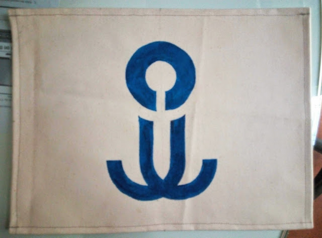
My style is minimalism.I am the kind of person who loves to keeps things simple.I designed my monogram using simple because it is easy to manage the space for my design.My previous assignment are have a similarity which is "simple".The reason i do my assignment simple is because
sometimes we don't need to have a lot of design to be beautiful or easily recognize by people.For example Nike and Addidas.I am interested in architecture therefore I will design my monogram as similar to architecture design.I apply perspective, number, and objects to my monogram.I take this assignment as a challenge to design a logo for my future company(If I can start a firm by myself).In other words it is a style that describe an extremely organized and efficient work with a defined in a 

matter of design.The minimalist design describe as a bold yet superficial attitude in matter of design.


Minimalist pattern 

  • Sleek, simple shapes and patterns in a monochrome, toned-down palette
  • Black is your best friend 
  • Classic, simple style with a twist
  • White is perfect for this concept. Bright, white is the supremo choice however, off whites will work well also.


Wednesday, 17 September 2014

Self portrait


Miss Lisa asked us to make a self portrait.During the process in finding my won self portrait i explore about other people self portraits in the internet and most of them are unique so i try to come out with my own design of self portrait by combining other people artworks together.i spend a lot of tume trying to figure out how to make my self portrait look alike as myself.i tried typography but i felt like it was too common and some of my classmates will do the same so i reject my own typography and start another kind.Luckily Miss lisa gave us an assignment on paper cut out and i use most of my cutting skills and apply it at my self portrait.after my self portrait is done,i applied colour by flicking the brush to make spots and i use the straw to blow the watercolour so that it may look more dynamic.the colour i used in my painting is red ,blue,yellow,and green.then reason i use red colour is because it is my favorite colour and it can maych with most of the colours.Red represent passion and bravery.the blue resembles the cool emotion i have.i am not a hot tempered person.the blues also resembles sadness.when my girlfriend broke up with me i am depressed and i intended to paint to release my depression.the yellow represent happiness and friendship.i can make friends easily because i wanted to make more friends.There is a quote "the more,the merrier".the colour green reminds me of me and my friend fishing at a valley and you may ask how did the colour green represents that? Especially the green is representing the colour of the pond water and its scenery.I use it because the water ,fish and scenery is healthy.green represent healthy.I am very happy that Miss Lisa gave us this assignment because it is a way we can express ourself more by painting.

Tuesday, 12 August 2014

Expanding square

Miss Lisa gave us an assignment on expanding square.It is an interaction between dark and light. Creating a black and white collage out of a simple square, and learning about positive and negative space.We were asked to produce 2 different expanding square.one of them is symmetrical and the other is asymmetrical.The theme I use is interior design.I choose to draw it from a top view because it is easier to manage the space
Lesson learnt:
1. To learn about positive and negative space.
2. To use a simple square and all the negative cuttings to create a collage, which will inspire a mask.
3. To understand about symmetry and asymmetry, and the Principle of Design, Balance.
4. To understand the Elements of Art: Space and Shape (Positive and Negative).
5. Good design has a balance of light and dark.
6.Craftsmanship is essential to good design.

Experimenting the assignment


Cut the design or pattern

Manage the space and arrange it to make it so that it may have a unique design


The final outcome


Friday, 20 June 2014

Greeting card

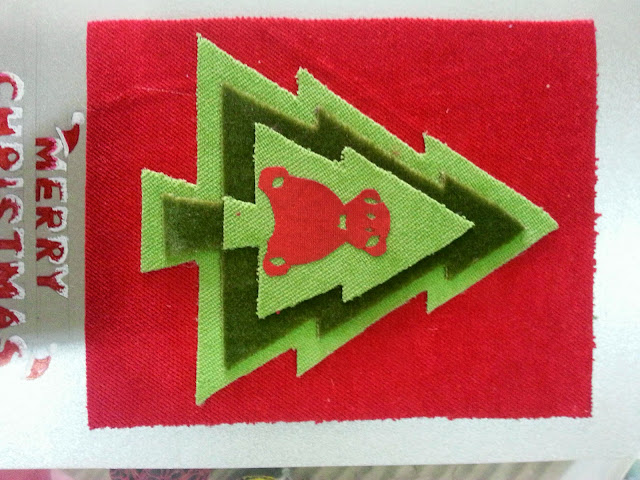
This is our final assignment and Miss Lisa wanted us to make 3 greeting card.I showed her 3 theme which was teddy bear,typography and bird.Then Miss Lisa wanted me to do teddy bear because she said that teddy bear is commonly use in greeting card.We must apply what Miss Lisa taught us for the 18 weeks in the grerting card which is art movement,paper cut out and colour theory.

Progress and experimenting the greeting card

Final result
Christmas greeting card
The main colours of Christmas are red, green and gold, white and silver. Red is the colour of love and energy. The colour green like Holly and Mistletoe have been used to decorate and brighten up buildings during the long dark winter. They also reminded people that spring would come and that winter wouldn't last forever!Snowflakes, winter wonderlands, Santa'beard, the white robes of Christmas angels, white is a colour of purity and cleanliness Silver, like gold, symbolises riches. Silver is a symbol of strength and can also be related to the moon and feminine energy. 

Happy Birthday greeting card
Red draw the attention of the person away from the words and what you are trying to get the person to read.Purple symbolizes enchantment and originality.Orange are colour of enthusiasm and fascination.The 
color yellow evokes feelings of joy and also a symbol of friendship.The color green represents health, 

resilience, good fortune and youth.


Valentine's greeting card
I use red ,white and pink in Valentine's greeting card because they look great in these colours.The colour red represents love.Pink represents affection, sweetness and understanding.White symbolize spiritual,love, purity, reverence and humility. They can also connote faithfulness, a valuable component in any love relationship.